坚果礼盒包装设计
以葫芦福禄为核心意象,藤蔓提手设计实现 “把福提在手上” 的情感表达。腰封金线压纹呈现福鹿岛场景,与外盒形成简繁对比,可灵活适配渠道需求。内外视觉呼应,工艺与文化兼具,打造兼具东方美学与礼赠价值的坚果礼盒。
创作信息
作品名称:大满坚果 大满提福坚果礼 品牌持有:三只松鼠 股份有限公司
遇义团队成员
原创设计:陈 义文 许 英达 视觉表现:董 天 插画设计:花椒的Alex 运营推广:吕 宇星 王 钰
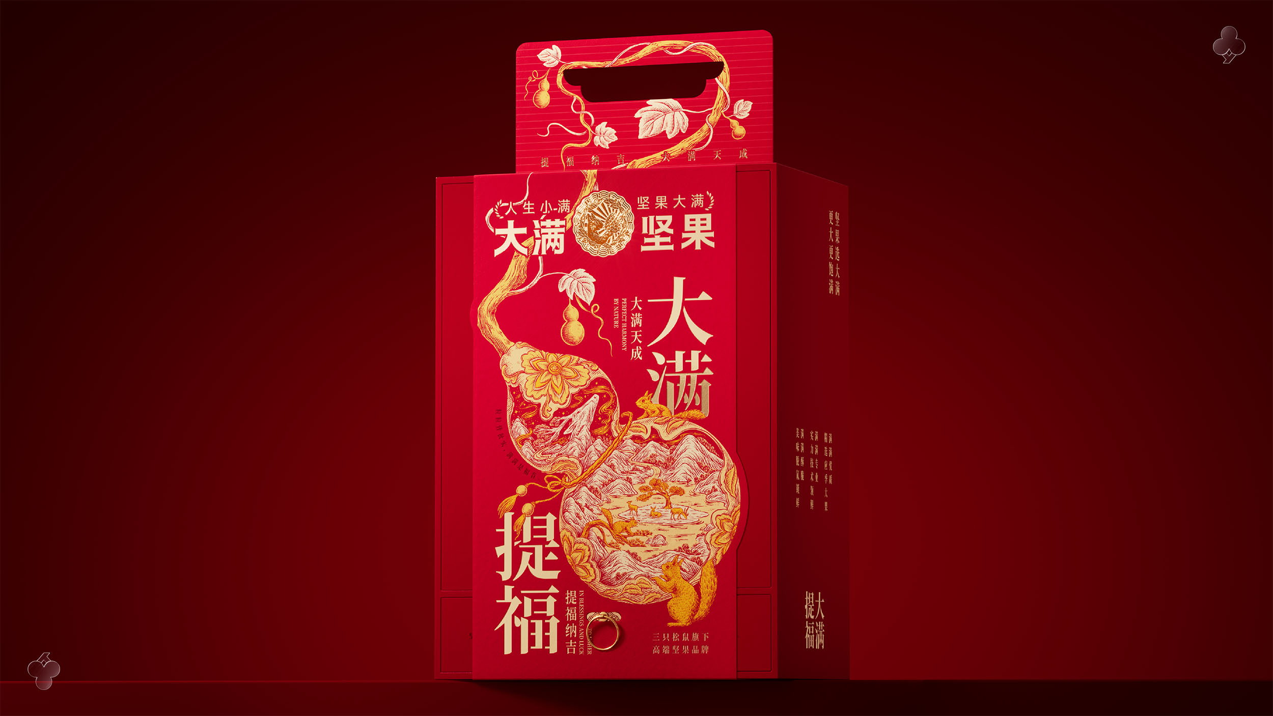
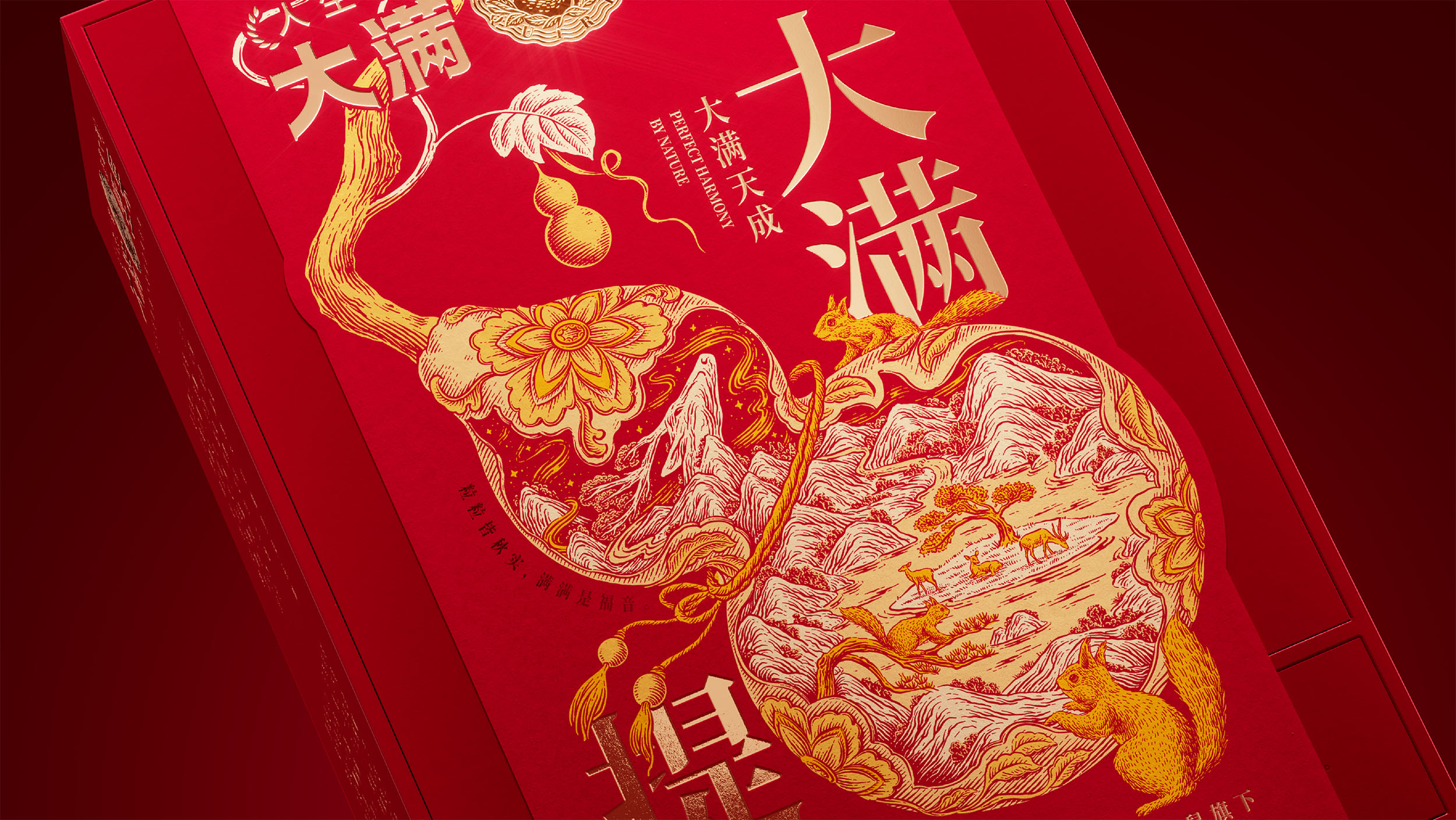
大满提福以中式含蓄丰盈的自然美学为基底,围绕 “葫芦福禄” 的吉祥意象构建视觉体系。以葫芦为核心载体,内部绘有福鹿岛场景,搭配吉祥花、福结、松鼠等元素,传递 “福禄双全” 的文化寓意。提手部分以葫芦藤蔓为灵感,藤蔓从盒身延伸至提手处,既解决了提手仅作工具的单薄感,又通过物理、视觉与心理三层关联,实现 “把福提在手上” 的情感表达,契合礼赠场景的心理需求。
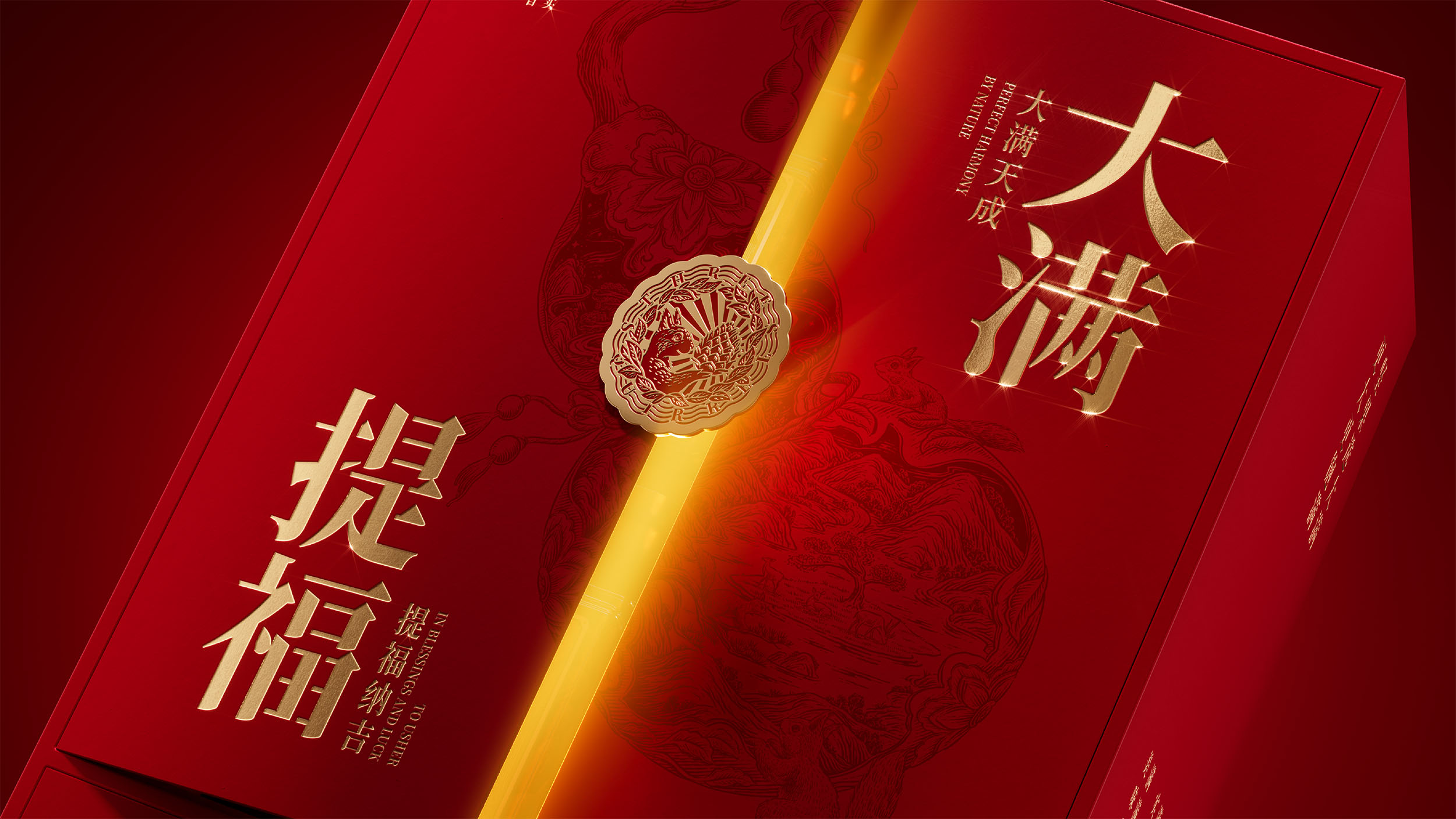
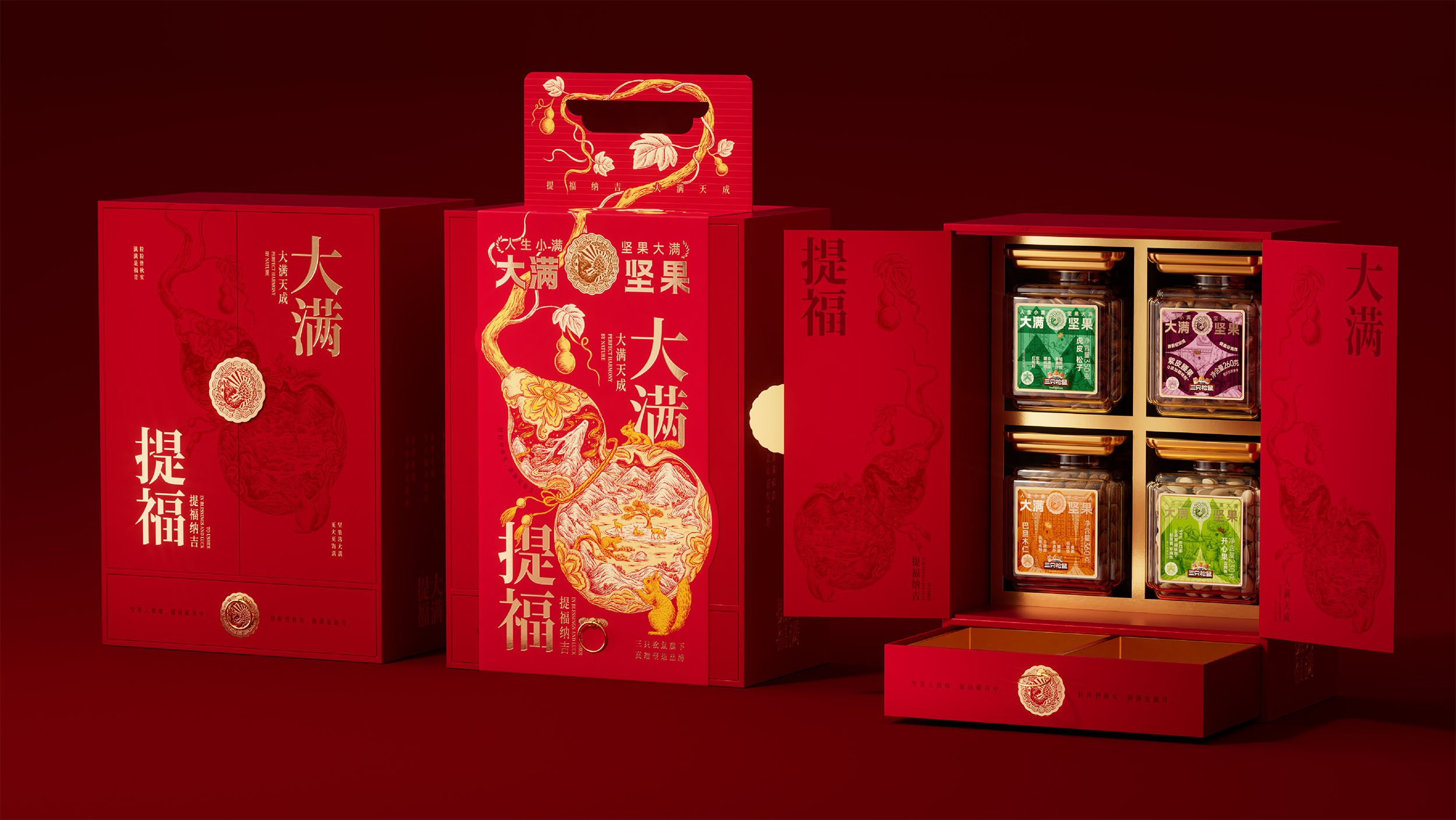
礼盒以腰封与外盒形成简繁对比,腰封采用金线压纹工艺,呈现丰富的插画细节,强化主题叙事;外盒则保持简洁克制,延续品牌识别度,同时可根据渠道需求灵活调整设计元素。开启结构实现内外呼应,内部罐形产品与外部视觉资产统一,金线压纹工艺贯穿整体,既凸显东方美学的精致质感,也构建起完整的品牌视觉体系,实现文化表达与礼赠功能的深度融合。
Grounded in a subtle, nature-inspired Chinese aesthetic, the "Da Man Ti Fu" collection centers its visual identity on the gourd (Hulu), a symbol of fortune and wealth. The gourd serves as the canvas for an illustration of "Fortune Deer Island," paired with auspicious flowers, blessing knots, and squirrels to convey wishes of double prosperity. Inspired by gourd vines, the handle extends seamlessly from the box. This design transforms a functional tool into an emotional gesture, allowing consumers to literally "carry blessings in hand" during festive gifting.
The packaging utilizes a striking contrast between a detailed belly band and a minimalist outer box. The band features intricate illustrations with gold foil embossing to enrich the narrative, while the clean outer box maintains strong brand recognition. Inside, the canisters mirror the exterior artwork and gold foil accents, establishing a cohesive visual system that beautifully fuses cultural storytelling with premium gifting functionality.
放学别走
这里整理了遇义的办公室地址、邮箱及日常联系方式。无论是品牌合作、项目咨询、视觉委托,还是关于品牌、包装与视效的交流,都欢迎通过邮件与我们取得联系。如果你对我们的作品、合作流程或解题方式感兴趣,也欢迎随时与我们交流。