咖啡品牌包装设计
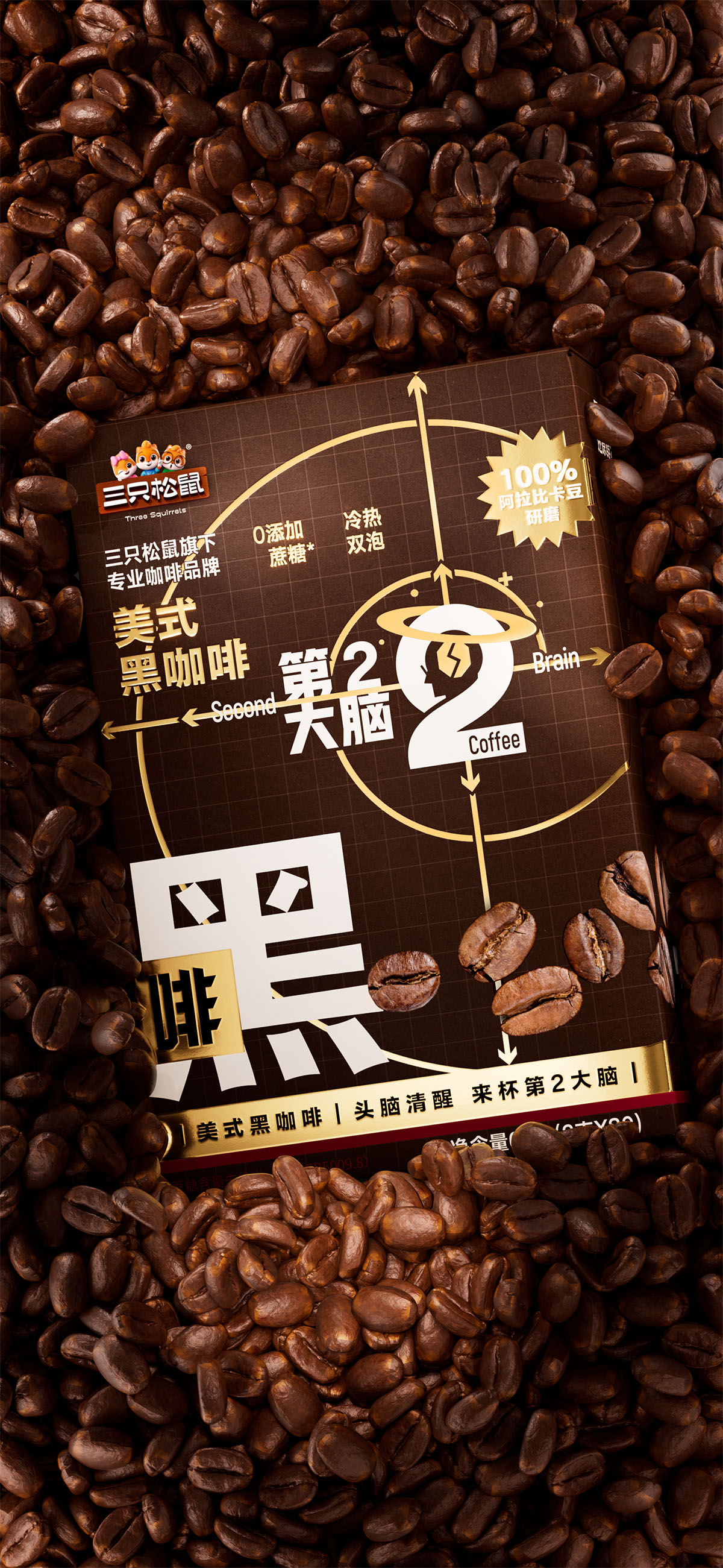
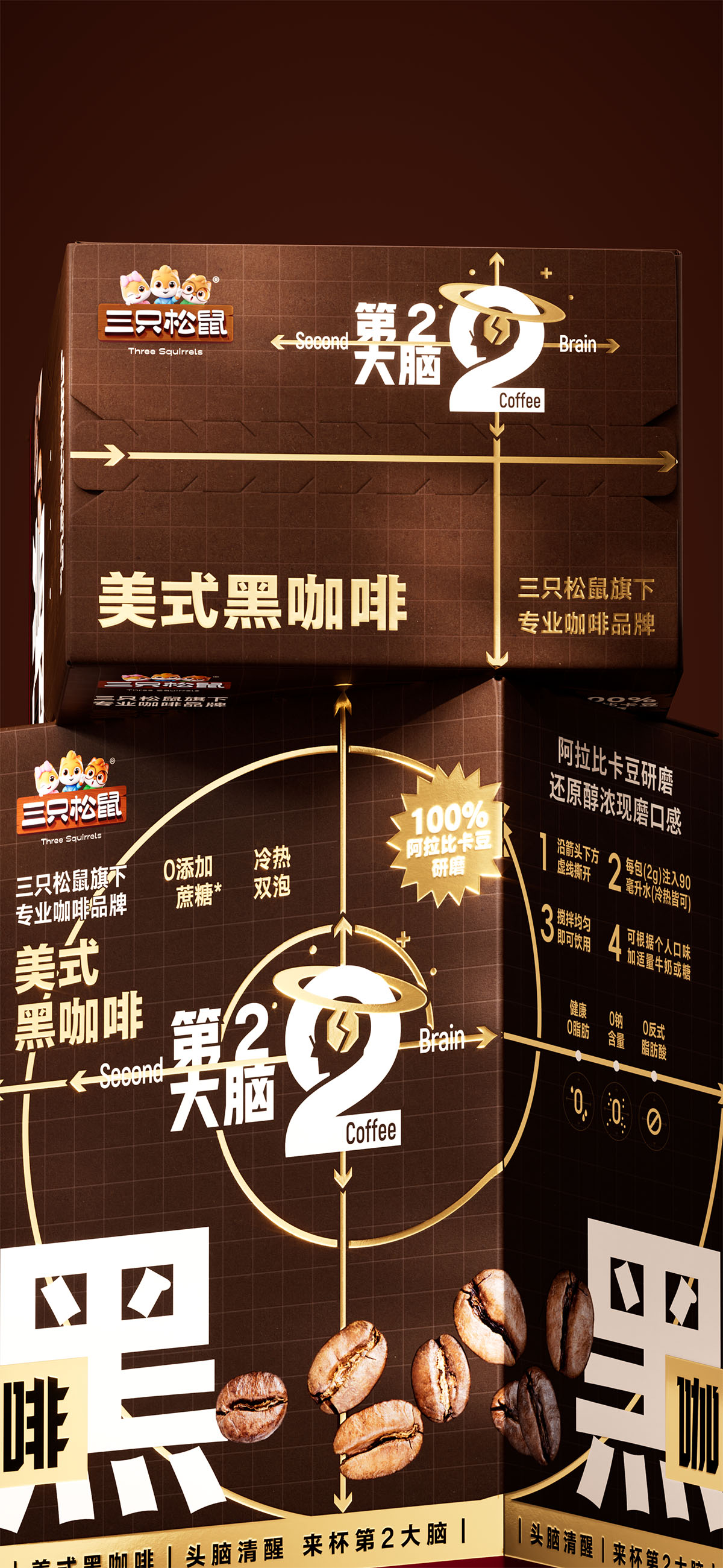
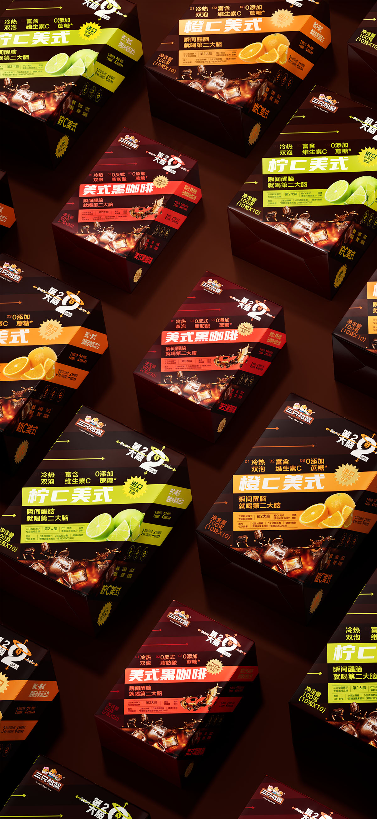
“第二大脑”以思考、理性与能量为核心,将咖啡的提神属性转译为持续清醒的精神状态。设计从笛卡尔“我思故我在”出发,以坐标系、函数几何与大脑形态构建品牌视觉系统,通过逻辑化结构建立清晰识别。不同函数对应不同风味与品类,使品牌在统一体系中自然延展。箭头、坐标与汉字图形共同形成“计算式的清醒感”,让理性秩序与灵感自由在同一系统中共存。
创意说明
“第二大脑”以“思考”作为品牌原点,将咖啡从单纯的提神饮品延伸为理性、专注与能量的象征。在信息过载与高频运转的时代,品牌借由“大脑”这一核心意象,回应当代人对于清醒、效率与脑力续航的需求。设计从笛卡尔“我思故我在”出发,将理性精神与思维秩序转化为品牌语言,以坐标系、函数结构与数字“2”构建完整视觉系统。大脑轮廓与咖啡豆形成正负形关系,坐标轴不断延展,象征思考与能量的持续生长,让品牌建立起清晰而理性的识别体系。
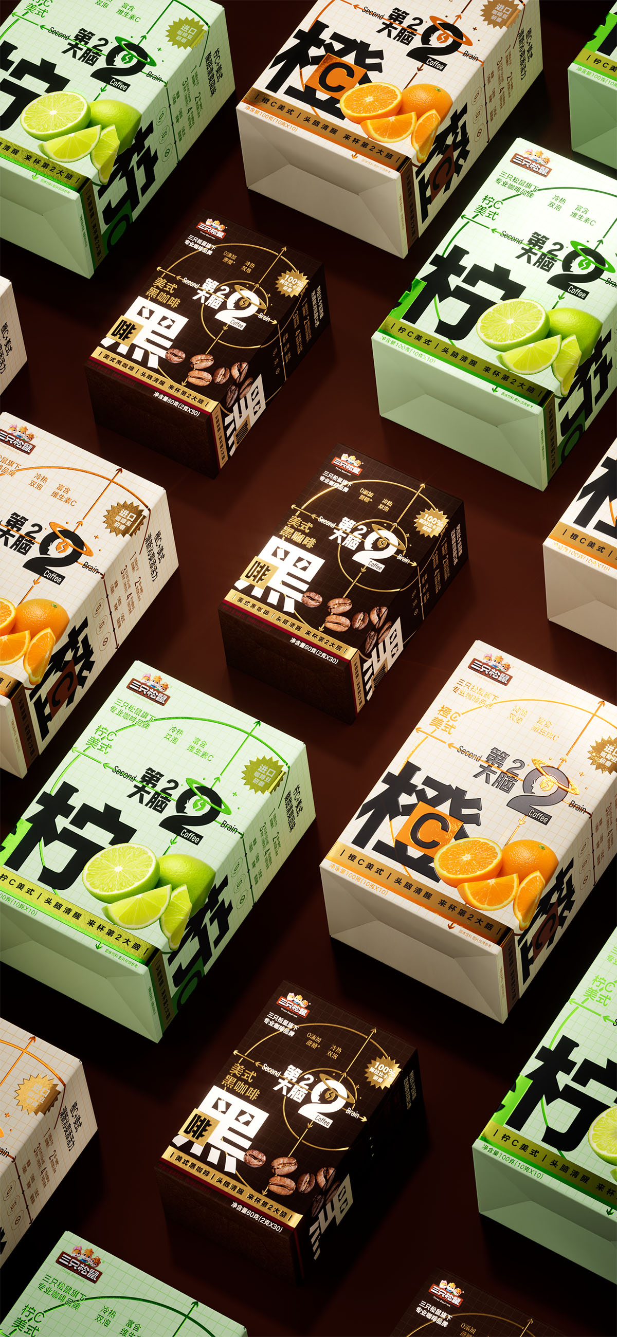
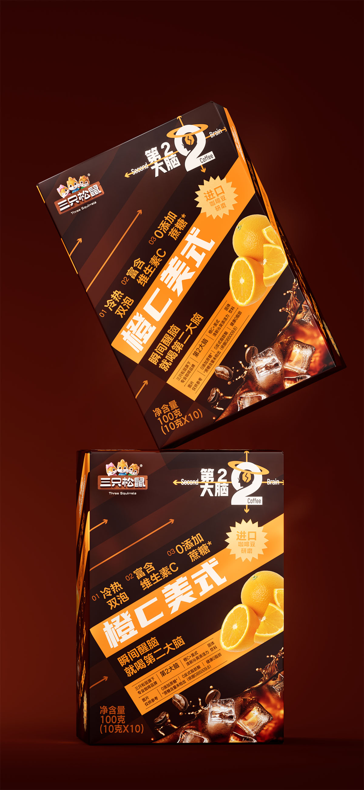
整体系统以“函数逻辑”作为生成规则,不同品类如同变量输入,在统一结构中形成各自独立的表达。橙C、柠C通过圆形函数构建轻盈平衡的节奏感,黑咖啡则以螺旋函数呈现专注与深度;箭头元素进一步强化速度、方向与能量上升的感知,使理性结构具备动态张力。包装中的汉字识别系统,将“橙”“柠”“黑”等风味信息直接转化为高辨识度图形,在提升阅读效率的同时强化品牌记忆。整个设计并非单纯的造型表达,而是通过逻辑、秩序与视觉生成关系,构建一种“计算式的清醒感”,让品牌在持续思考中完成自我生长。
“Second Brain” positions coffee as more than a functional beverage, transforming it into a symbol of rationality, focus, and mental energy. Inspired by Descartes’ “I think, therefore I am,” the design translates systems of thought into a visual language built from coordinate grids, mathematical functions, and the number “2.” The relationship between the brain silhouette and coffee bean creates a sharp visual identity, while expanding coordinate structures symbolize the continuous growth of thought and energy.
The system follows a logic-based framework where each product category functions as a variable within a unified structure. Orange C and Lemon C use circular compositions to express lightness and balance, while black coffee adopts spiral forms to convey focus and depth. Arrow elements reinforce movement and rising energy, while flavor-related Chinese characters are transformed into recognizable graphic symbols that strengthen readability and brand memory. Through logic, order, and generative visual relationships, the design establishes a clear sense of “calculated clarity” for the brand.
创作信息
作品名称:第2大脑 品牌包装设计 品牌持有:三只松鼠 股份有限公司
遇义团队成员
原创设计:陈 义文 吕 宇星 视觉表现:董 天 运营推广:王 钰 吕 宇星
放学别走
这里整理了遇义的办公室地址、邮箱及日常联系方式。无论是品牌合作、项目咨询、视觉委托,还是关于品牌、包装与视效的交流,都欢迎通过邮件与我们取得联系。如果你对我们的作品、合作流程或解题方式感兴趣,也欢迎随时与我们交流。