中式糕点包装设计
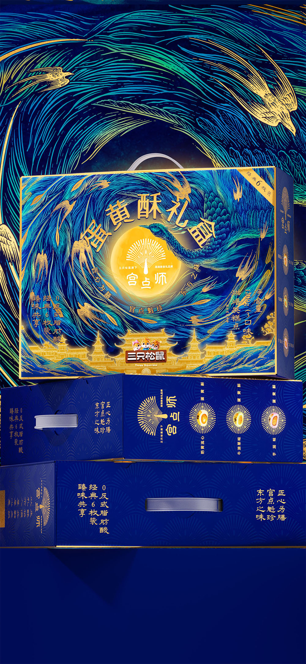
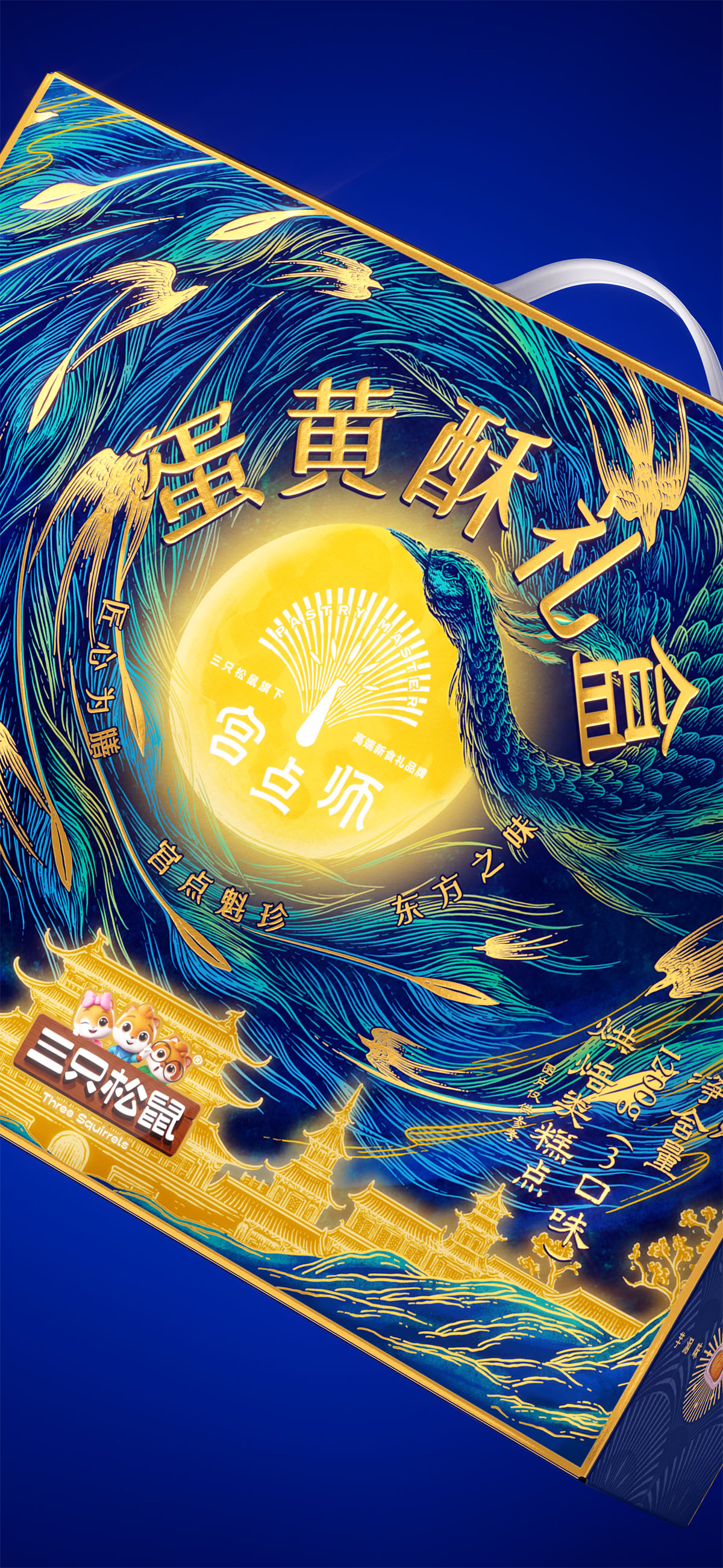
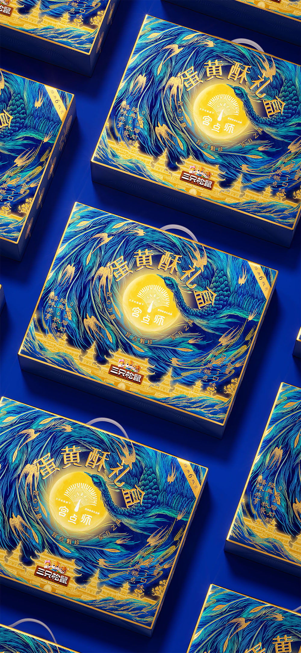
宫点师以以孔雀为核心母题,提炼尾羽开屏的放射节奏,构建“中心形状+外圈秩序”的品牌语言。蛋黄酥礼盒以“孔雀入月”为核心结构,将圆月与产品形态形成关联,强化品类记忆。蓝孔雀色与金色细节共同营造克制典雅的东方礼感,并通过宫殿元素深化“宫廷点心”的品牌认知。
创意说明
宫点师以“东方新食礼”为方向,围绕中式糕点的当代表达,建立清晰的品牌气质与识别体系。视觉以孔雀为核心母题,提炼开屏尾羽的放射节奏,构建“中心形状+外圈秩序”的基础结构,延展为统一的品牌语言。
蛋黄酥礼盒作为体系起点,以“孔雀入月”为核心结构建立整体表达。圆月作为视觉中心,对应产品形态,形成明确的品类联想与记忆锚点;尾羽由外向内形成放射节奏,构建稳定有序的画面结构。
整体以蓝孔雀色为主,辅以金色细节,传递克制而典雅的东方礼感。宫殿元素与品牌名称形成支撑关系,强化“宫廷点心”认知,并为后续视觉延展提供基础。
Positioned around the idea of “New Oriental Gifting,” Gongdianshi creates a contemporary identity for traditional Chinese pastries through a clear and recognizable visual system. The peacock serves as the core motif, with the radiating rhythm of its tail feathers distilled into a structured composition of “central form + surrounding order,” forming a unified brand language.
As the foundation of the system, the salted egg yolk pastry gift box centers on the concept of “Peacock Embracing the Moon.” The full moon acts as the visual focal point, echoing the product form while creating a strong category memory. Radiating feather patterns establish a balanced and orderly composition. Peacock blue paired with refined gold detailing conveys a restrained Eastern gifting aesthetic, while palace-inspired elements strengthen the perception of imperial-style pastries and support future visual extensions.
创作信息
作品名称:宫点师 蛋黄酥包装设计 品牌持有:三只松鼠 股份有限公司
遇义团队成员
原创设计:陈 义文 许 英达 陶 宗锃 视觉表现:董 天 插画设计:花椒的Alex 运营推广:吕 宇星 王 钰
放学别走
这里整理了遇义的办公室地址、邮箱及日常联系方式。无论是品牌合作、项目咨询、视觉委托,还是关于品牌、包装与视效的交流,都欢迎通过邮件与我们取得联系。如果你对我们的作品、合作流程或解题方式感兴趣,也欢迎随时与我们交流。