礼盒包装设计
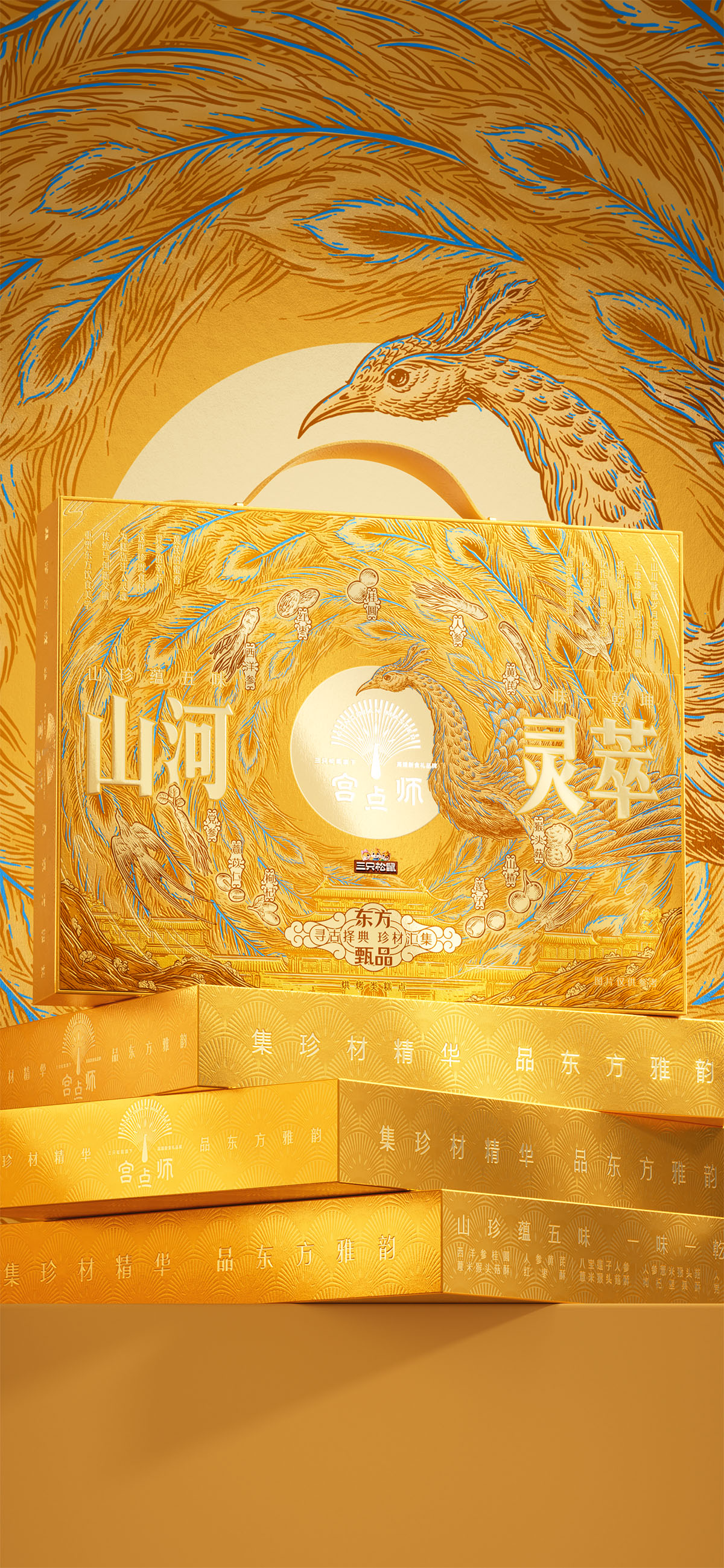
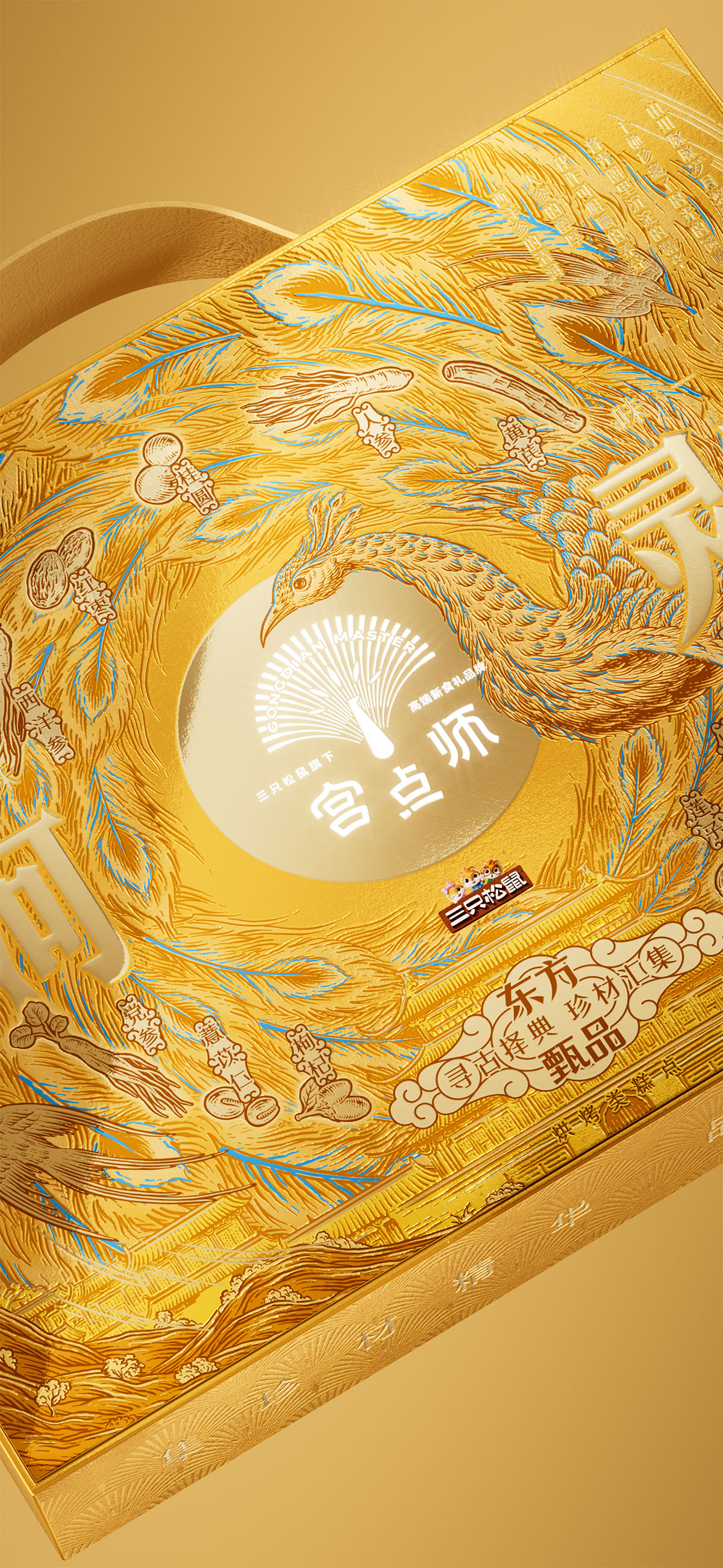
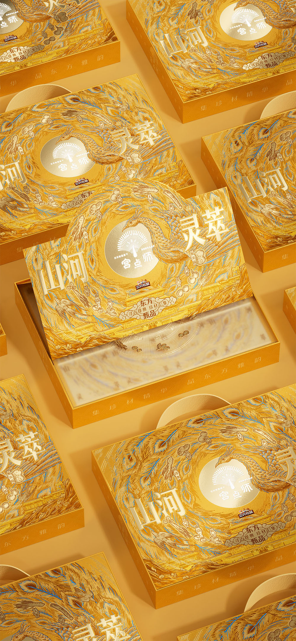
山河灵萃礼盒延续宫点师“东方新食礼”的品牌体系,以孔雀纹样与“中心聚焦+外圈秩序”的视觉语言为基础,强化礼赠层级感。整体采用鎏金主色,结合高密度纹理与精细刻画,营造厚重典雅的东方气质。盘旋孔雀围绕中心形成聚拢结构,多种药食同源食材融入其中,搭配立式盒型与山河宫殿元素,构建更具仪式感的高端礼赠体验。
创意说明
宫点师以“东方新食礼”为方向,围绕中式糕点的当代表达,建立清晰的品牌气质与识别体系。视觉以孔雀为核心母题,提炼开屏尾羽的放射节奏,构建“中心形状+外圈秩序”的基础结构,延展为统一的品牌语言。
山河灵萃礼盒在既有视觉体系上进一步强化层级与礼赠属性。整体以鎏金为主色,结合高密度纹理与精细刻画,提升画面的厚重感与价值感。孔雀由开屏转为盘旋姿态,围绕中心形成向内聚拢的结构,使视觉更集中且具仪式张力。
多种药食同源食材被嵌入旋转秩序中,既丰富内容层次,也保持信息的清晰可读。礼盒结构改为立式,使金色山河能够被完整展示。宫殿与山河在下方展开,构建出稳定的东方空间感。整体来看,山河灵萃礼盒保持了宫点师的体系语言,同时把视觉提升到更高的礼赠级别,让产品在品牌中有明确的层次位置。
Positioned around the idea of “New Oriental Gifting,” Gongdianshi creates a contemporary visual system for traditional Chinese pastries through a unified brand language centered on the peacock motif. The radiating rhythm of peacock feathers forms a structured composition based on “central focus + surrounding order.”
Building on this system, the Shanhe Lingcui gift box strengthens both hierarchy and gifting value. Gold tones, refined textures, and detailed graphics create a richer and more ceremonial visual experience. The peacock shifts into a circling posture around the center, forming a more concentrated and ritual-like composition. Functional ingredients are integrated into the rotating structure to enrich content while maintaining clarity. Combined with a vertical box format and layered palace-and-landscape imagery, the design elevates the product into a more premium gifting tier while remaining consistent with the Gongdianshi visual system.
创作信息
作品名称:宫点师 山河灵萃礼盒包装设计 品牌持有:三只松鼠 股份有限公司
遇义团队成员
原创设计:陈 义文 许 英达 视觉表现:董 天 插画设计:花椒的Alex 运营推广:吕 宇星 王 钰
放学别走
这里整理了遇义的办公室地址、邮箱及日常联系方式。无论是品牌合作、项目咨询、视觉委托,还是关于品牌、包装与视效的交流,都欢迎通过邮件与我们取得联系。如果你对我们的作品、合作流程或解题方式感兴趣,也欢迎随时与我们交流。