沙琪玛包装设计
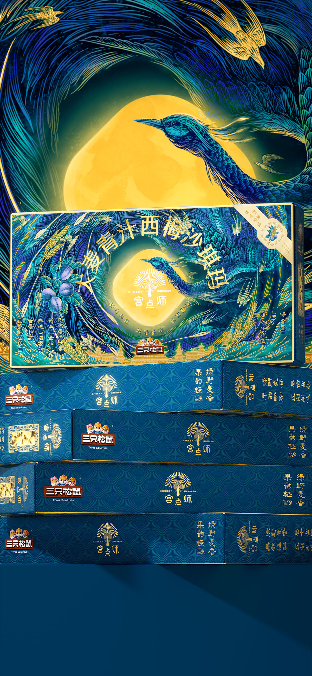
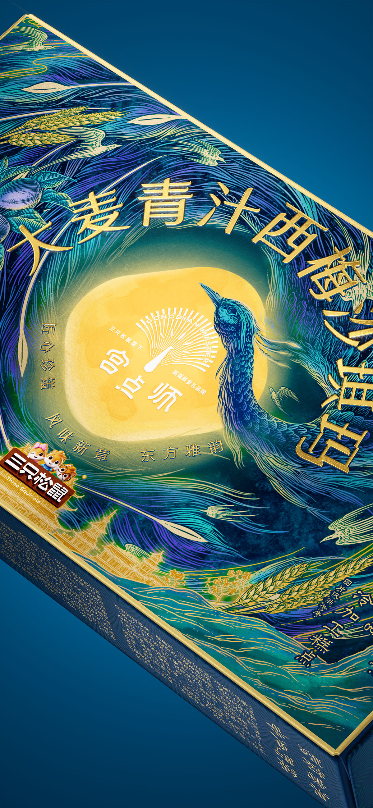
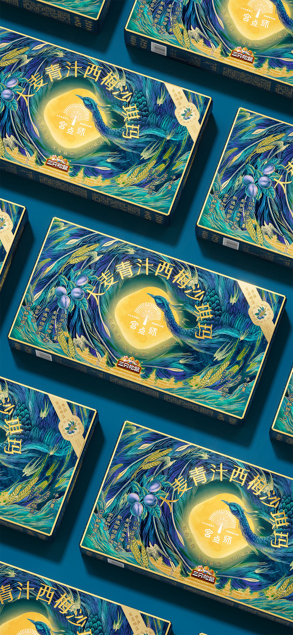
沙琪玛包装在既有视觉体系下完成品类延展,延续“中心焦点+外圈节奏”的构成逻辑,以中心高光与开窗设计强化产品真实感与视觉聚焦。青绿色调呼应谷物与果干风味特征,使视觉表达与口感形成联动。孔雀形象以舒展姿态贯穿画面,结合麦穗与果实元素,构建有序流动的层次节奏,在统一设计语法中实现新品的自然融入与持续延展。
创意说明
宫点师以“东方新食礼”为方向,围绕中式糕点的当代表达,建立清晰的品牌气质与识别体系。视觉以孔雀为核心母题,提炼开屏尾羽的放射节奏,构建“中心形状+外圈秩序”的基础结构,延展为统一的品牌语言。
沙琪玛在既有视觉框架下完成品类适配,延续“中心焦点+外圈节奏”的构成逻辑。通过中心高光聚焦视线,并以开窗设计直接呈现产品本体,强化真实感与可感知度。整体采用青绿色调,呼应谷物与果干特征,使视觉表达与风味形成对应关系。
孔雀形象以舒展姿态贯穿画面,尾羽形成有序的流动节奏,引导视觉阅读。麦穗与果实元素,增加信息层次,同时保持整体结构的稳定。设计在统一语法下调整内容与材质表现,使新品能够自然融入体系并持续延展。
Positioned around the idea of “New Oriental Gifting,” Gongdianshi builds a contemporary visual system for traditional Chinese pastries through a clear and recognizable brand language. Centered on the peacock motif, the design extracts the radiating rhythm of tail feathers to form a structured composition based on “central focus + surrounding order.”
Within this framework, the Sachima packaging adapts the system to a new category while maintaining visual consistency. A highlighted center and window structure directly showcase the product, enhancing authenticity and visibility. Green tones reference grains and dried fruits, creating a direct connection between flavor and visual expression. Flowing peacock feathers guide the composition, while wheat and fruit elements enrich the visual layers without disrupting the overall order, allowing the new product to integrate naturally into the broader brand system.
创作信息
作品名称:宫点师 大麦青汁西梅沙琪玛 品牌持有:三只松鼠 股份有限公司
遇义团队成员
原创设计:陈 义文 许 英达 视觉表现:董 天 插画设计:花椒的Alex 运营推广:吕 宇星 王 钰
放学别走
这里整理了遇义的办公室地址、邮箱及日常联系方式。无论是品牌合作、项目咨询、视觉委托,还是关于品牌、包装与视效的交流,都欢迎通过邮件与我们取得联系。如果你对我们的作品、合作流程或解题方式感兴趣,也欢迎随时与我们交流。