精酿啤酒包装设计
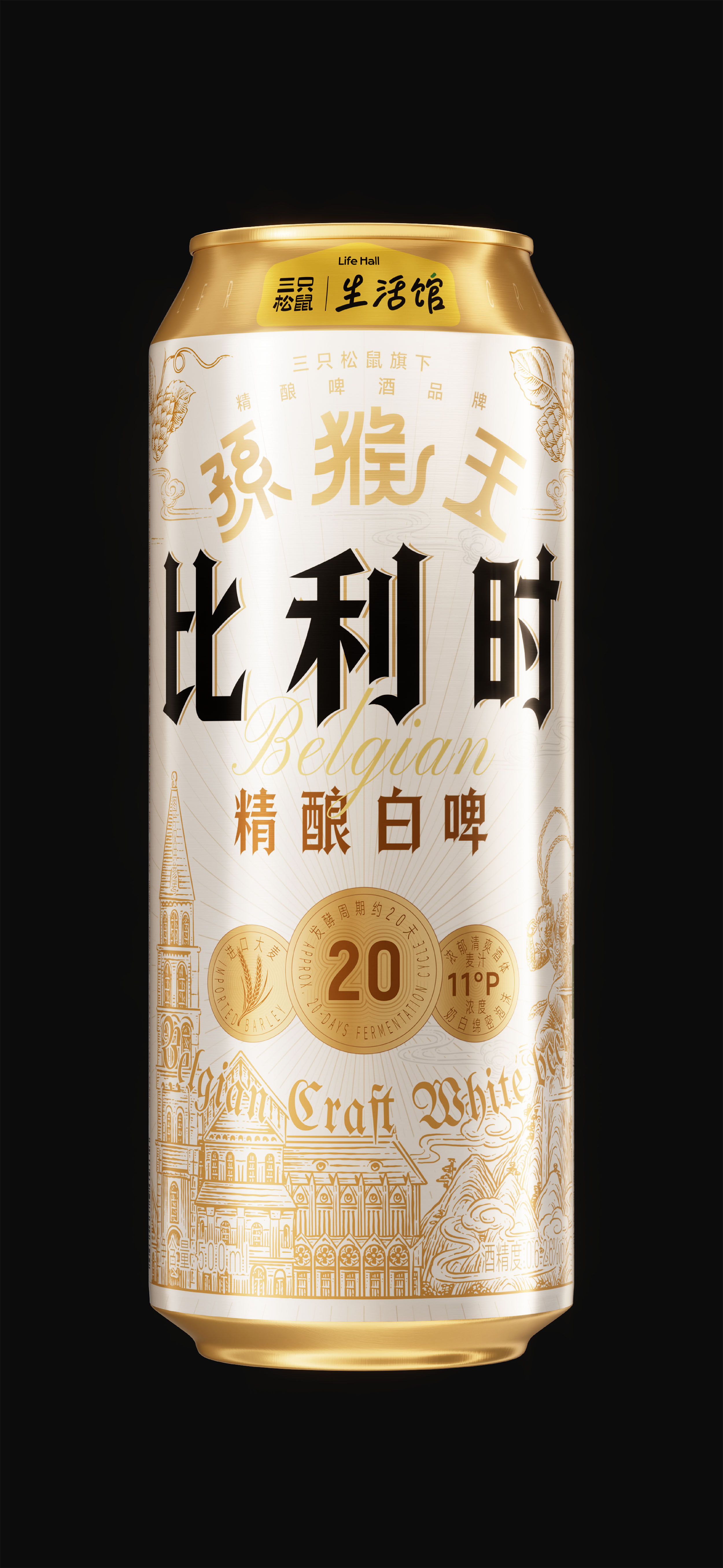
白金配色呼应酒体特质与欧式典雅气质。中心构图集中呈现核心信息,搭配金牌模块突出发酵周期、酒精度等卖点,强化品质感知。插画融合孙猴王 IP 与比利时建筑、啤酒花元素,构建中西交融的叙事,实现品牌文化与品类特质的统一,塑造兼具底蕴与竞争力的精酿形象。
创作信息
作品名称:孙猴王 比利时精酿白啤 品牌持有:三只松鼠 股份有限公司
遇义团队成员
原创设计:陈 义文 许 英达 谷 振 视觉表现:董 天 插画设计:花椒的Alex 运营推广:吕 宇星 王 钰
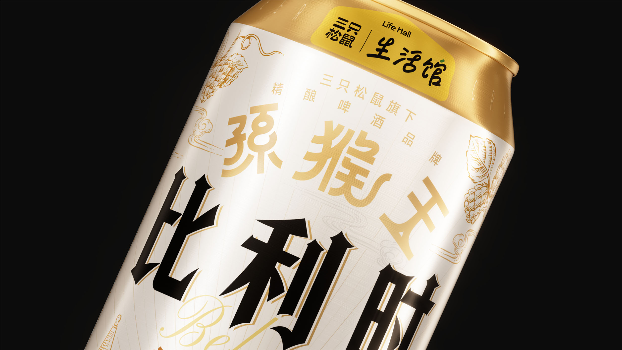
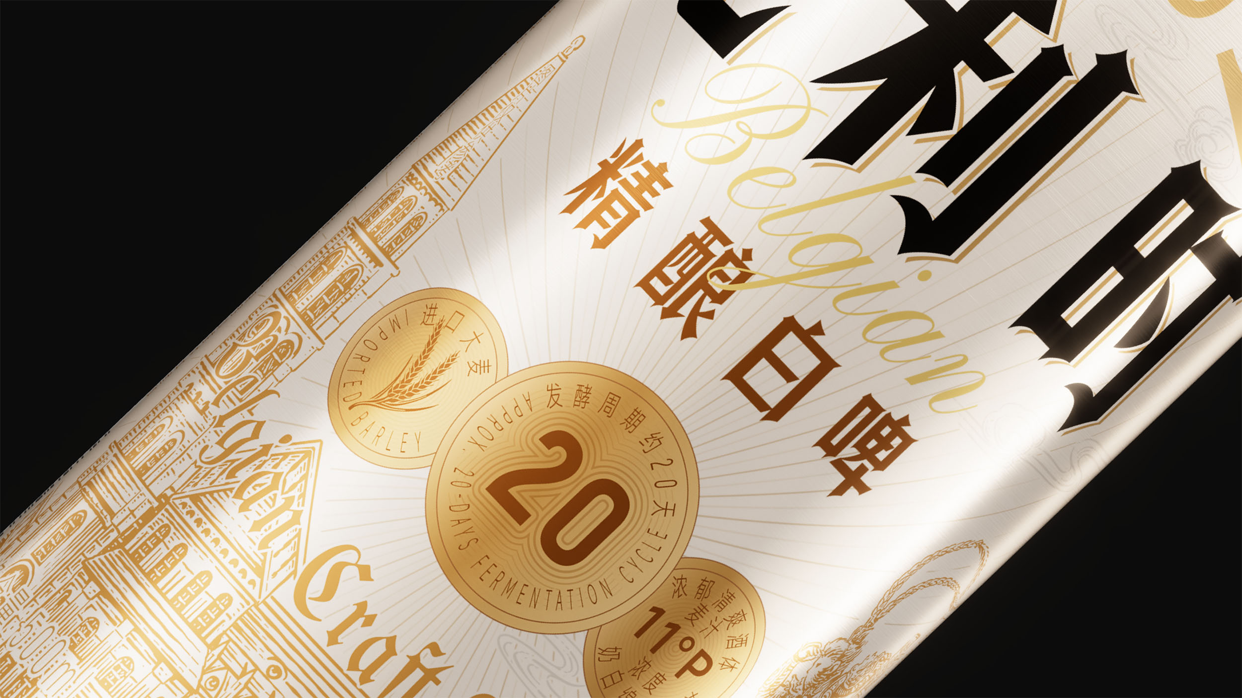
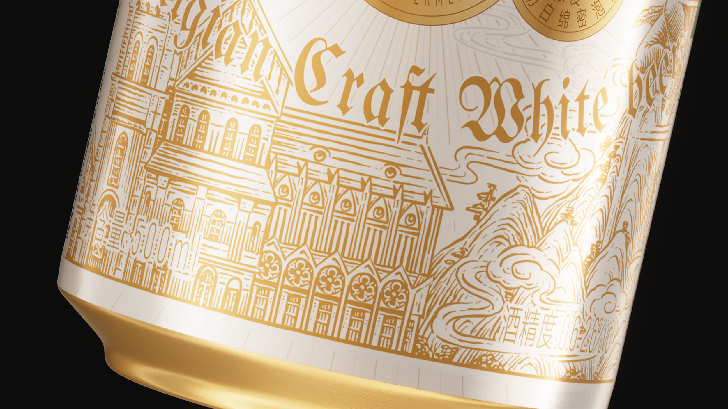
孙猴王比利时精酿白啤归属于品牌经典线,采用同品类统一版式、差异化保护图形的设计逻辑,兼顾系列秩序感与单品辨识度。包装以白金为主色调,白色贴合白啤酒体特质,金色强化专业精致感,整体呈现欧式精酿的典雅气质。版式采用中心构图,将品牌、品类、度数等核心信息集中呈现,搭配英文花体字与金牌腰带视觉模块,突出原料、发酵周期、酒精度等关键卖点,降低识别成本,强化品质感知。
插画融合中式 IP 与欧式风格,将孙猴王、花果山等中式元素与比利时欧式建筑、啤酒花相结合,构建中西交融的视觉叙事,强化产品产地属性与品牌文化联结。酒体呈朦胧淡金黄色,泡沫绵密洁白,设计语言与产品口感、风味高度呼应。整套设计以统一版式为骨架、文化符号为灵魂、品质信息为支撑,实现经典线视觉体系、品牌 IP 与比利时白啤品类特质的高度统一,塑造兼具文化底蕴与市场竞争力的精酿啤酒包装形象。
The Sun Houwang Belgian Wheat Beer, part of the classic line, uses a unified layout with differentiated graphics to balance series cohesion and individual recognition. A white-and-gold palette—white reflecting the beer’s body, gold highlighting craftsmanship—conveys European-style elegance. Centered layouts showcase brand, category, and alcohol content, with script typography and a gold sash emphasizing key selling points like ingredients and fermentation, reinforcing quality and readability.
Illustrations merge Chinese IP elements, like Sun Houwang and Flower-Fruit Mountain, with Belgian architecture and hops, creating a cross-cultural narrative that highlights origin and heritage. The pale golden beer and dense white foam are mirrored in the design, aligning visuals with taste. This system integrates layout, symbolism, and product information to create a cohesive classic-line identity, combining brand IP with Belgian wheat beer traits for culturally rich, market-ready craft beer packaging.
放学别走
这里整理了遇义的办公室地址、邮箱及日常联系方式。无论是品牌合作、项目咨询、视觉委托,还是关于品牌、包装与视效的交流,都欢迎通过邮件与我们取得联系。如果你对我们的作品、合作流程或解题方式感兴趣,也欢迎随时与我们交流。